I’d love to give a brain dump of some of my motivations and thinking behind this series of NFTs I recently created.
I’ve been interested in the idea of drawing with light and what that means. Light as both a particle and wave, something that is formless. It’s something I thought about when I got asked by Nosaj Thing to do the cover art for his single “For the Light.” How do I give light a feeling of having mass?
I was into the idea that when creating density with light, even when represented visually, it contains no mass. As volumetric as you can paint light it rarely feels solid.
Working with Nosaj, there were a lot of different ideas and drafts I was exploring on how to represent light. I had been thinking of Saul Bass’s rejected drafts for the movie poster for The Shining, how menacing yet wispy it was. (Note Kubrick’s harsh notes in ink.)
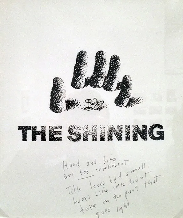
I was so seduced by its ability to take up so much density yet feel like nothing it all that it led me on some wild goose chases in trying to see if it was something I could replicate in other ways. None of these versions worked for the song.
I was happy with the ultimate result of where that ended up, but I also loved a lot of the drafts that were rejected. In fact No. 2 from this NFT series actually started out as a draft of the single art. I felt like I was getting close but it too was also deemed not appropriate.
But I liked where it was going. The density felt so different to other things that I’ve done with similar compositions and similar amounts of elements. More was going on visually, the imagery was more complex but it felt like it took up less space.
There’s always been this long back and forth dialogue in my work between minimalism and maximalism. There’s moments where I want something to be as quiet as possible with nothing extraneous.
And then there's other times where frankly, I just want to lay shit on like a mf.
And the parts of me that are attracted to lightness, quietness, and the parts of me that are attracted the density are two different facets of my personality. My Virgo Moon and Leo Rising signs. My design sensibility tell me to eliminate, and who I am as a person says don’t.
Sometimes I end up in extremes but mostly I strive for a balance of both heaviness and lightness with composition and scale. I lay things out in a way that cover the canvas as much as possible but with only extra large and extra small elements. No in-betweens. It creates tension because of the contrast in sizes between two elements but the elements themselves are limited in count.
I make both image-heavy and type-heavy work, but it’s all one thing: composition. The arrangement of objects. If I had to say what’s unique about my work—it’s the way I arrange things. A lot of that love came from being obsessed with Japanese fish tank layouts when I was younger.
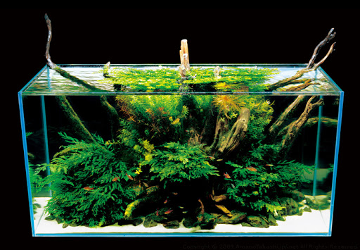
There genre of fish tank design I loved most: Iwagumi. It’s a Zen Buddhist framework of arranging rocks in a tank. One large rock (the Buddha), and smaller rocks orbiting it. The arrangement creates movement, the rocks feel suddenly weightless.
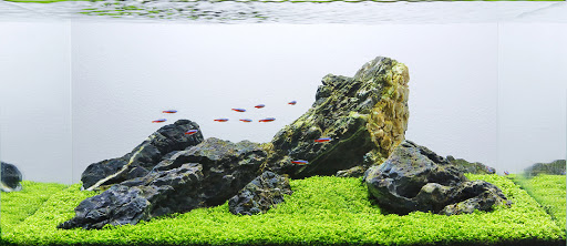
It shows up in my work in many ways.
The fish I loved observing most in these tanks weren’t the fish themselves. It was the shrimps. The bottom feeders. The insects. They rarely moved around a lot, but it was the way they, and the plants they surrounded themselves reflected the extreme, artificially harsh fish tank light. Under that unforgiving fluorescent I witnessed magical moments.
Shrimp, like other insects represent this primal assault on the visual senses. Even the harmless ones seen as threatening because of how they look, and often not much else. You also don’t have to paint an insect realistically either. Their silhouettes are universally known.
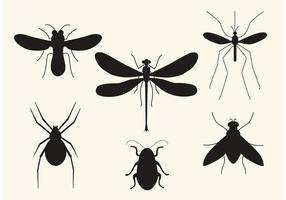
In that sense it was a good subject matter to investigate some of these visual strategies I was working through. You can change an insect’s color, and reduce and take away the fidelity of the image, yet they’re recognizable. It would take a lot light or shadow to drown them out.
And with animals in nature, bright colors more often signify danger.
The combination of all these elements and loose thoughts swirling resulted in this limited series, where I deal with how much space both physically and metaphorically some thing takes up? How confrontational can you be while feeling like nothing at all? It’s a question that’s confronted me as a life many times for various reasons: what does it mean to take up space? When are you too much?
This is something I intend to probably answer in as many ways as I can throughout the rest of my career out of both necessity and curiosity. For now, I’m choosing to look at the bright side of things (sorry.)
This article was adapted from a Twitter thread. The first four works of Chrysalides were listed on Foundation on 23 April 2021.
